
Pottery methods
 ES (Emmons & Sohne)
(Emons & Sohne, 1921-1974)
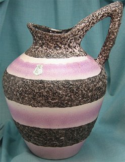
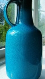
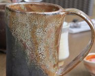
Quality of forms and decorations covered a broad range, but the good items are very good; one of the best is pitcher form 683, later released with shape number 883. As more items are properly attributed to ES, their status continues to rise.
This is the iconic form 683/883 with the typical ES foil label and one of their exceptional glazes.
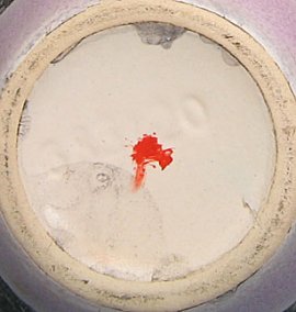
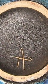
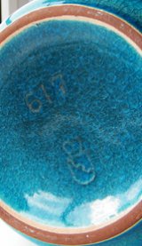
A few ES items have the company mark,
but it's more common to find just the form number
and size number, more or less centered. Clay is
fairly white, and the bottom is often glazed in the underglaze color.
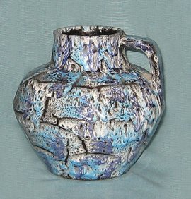
It's not uncommon to find ES items with no markings at all. Such items have to be attributed based on form or glaze (or label.keeping in mind that labels can be moved from item to item).
Some of the most exception items include what appear to be artist marks. Such items usually deserve a premium price just based on the glaze, but the artist marks will probably add to that if more information about the marks ever comes to light.
 Gräflich Ortenburg/Tambach
Gräfl Ortenburg (1946-1968)
(Photo courtesy of Lisa Aspden.)
(Photo courtesy of Lisa Aspden.)
The Gräflich Ortenburg/Tambach mark features a crown over a shield with a jagged line from the upper left of the shield to the lower right.
Clay is typically red, but unmarked pieces are hard to attribute.
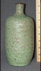
Gramann (Römhild)
The "standard" Gramann glazes have a granite
look and are done in both matte and high gloss
versions. Vases are often hand made.
Gramann also did a variety of other, typically
fascinating glazes.
Clay here is more orange than most Gramann items,
and it's believed that the larger mark denotes later work (still highly collectible). The mark is incised and often hard to read, but it's a T over R for Töpferei Römhild.
This dark red clay is more typical of Gramann, and the
small T over R mark is in the dry foot (exposed clay ring around the glazed center.
(1913-?)
Best known designs are by Paul Dresler, produced shortly before and perhaps shortly after WWII.
This is a classic Grootenburg glaze
designed by Paul Dresler. Common elements are
the green "copper patina" style glaze (often found
with reddish highlights) and the incised lines.
This is the Grootenburg mark, which looks like a house or castle with a tower on each end. The mark is quite often hard to see. This is a particularly clear example. The outline of Albert Kiessling's mark is almost identical, so check for signs of the towers.
Clay is a dark brown with reddish tone.
Much of Richard Uhlemeyer's work
resembles Dresler's. See the Uhlemeyer
section for examples and comparisons.
Hutschenreuther
(1857-)
Although...
Share this article
Related Posts


Latest Posts


